

Search engine optimisation (SEO) is not something I write about much. While I try to stay in touch with what's going on, I don't count myself as an expert on the topic. (Which is not to say that the countless self-proclaimed experts on the topic are all experts themselves.) However, there are a couple of changes website owners should be aware of that do (or will) affect the way Google ranks websites.
Mobile search results will soon favour mobile-friendly sites
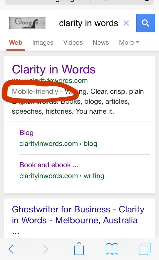
You may have read about the first change as it is starting to appear in mainstream media. It has nothing to do with the words on a website, but I include it here to help spread the word.
Dubbed 'mobilegeddon', it boils down to this: when someone does a Google search on their mobile device, the results Google returns will (very soon) give preference to websites that are 'mobile friendly'. Sites that previously ranked highly but are not mobile friendly may fall well down the ladder on smartphone and tablet search results.
What's a 'mobile friendly' site? It's a website that adapts its format to suit the device it is being displayed on.
That may mean that there is a separate mobile friendly version of the site (e.g. m.theage.com.au is the mobile site of The Age newspaper). Alternatively it means that the site has what's called a 'responsive' design, meaning that the site layout automatically adapts to the device being used to view it.
When I rebuilt our website last year, I deliberately chose a service with responsive design built in. My reasoning at the time was convenience for visitors as an increasing amount of web browsing is done on smartphones and tablets. That decision now has broader implications.

Desktop version

iPhone version
What does this mean for you? It means you're well placed if you already have a responsive website. On the other hand, if you rely on search to drive traffic to your site but it is not mobile friendly, it's probably time to do talk to your friendly web designer.
Keywords ain't keywords
This change is a year or two old now but I find many people are still unaware of it. It relates to the use of keywords in your website copy. In recent years Google has made changes to the algorithms it uses to assess the value, and therefore rank, of a website. This is part of Google's ongoing battle to reward 'real' websites and webpages while penalising those who try to game the system.
In the 'old' days, the goal when writing website content was to include a number of mentions of words or phrases that were both relevant to your website or business and likely to be searched for – so called 'keywords' and 'keyphrases'. So a burglar alarm supplier would want to use that term – 'burglar alarm' – a number of times, especially on their home page. Optimising 'keyword density' was the key.
Under the new regime, Google's computers are more interested in content that is readable and relevant to the searcher. They now look for synonyms of keywords (e.g. 'intrusion alarm') and shortenings of keyphrases ('alarm'). The search bots also assess words in the context of where they appear in the content (so as to distinguish a search for an Apple computer from a search for the fruit, for instance).
It's all a bit complicated and no one, other than perhaps a few Google insiders, knows exactly how it works. The important points are that your web content should be of a high quality, it should be readable and it should not appear 'over engineered' in an attempt to gain positive points from the search crawlers.
There is plenty of advice on this spread all over the web, which can be confusing. One practical and up-to-date overview I found is a short (paid) online course by a lady called Karon Thackston who seems to know her stuff. I'm currently adjusting our site's content as a result of what I learnt from her.
As usual, if you have any questions or comments, please add a comment below or contact me.
Thumbnail image: spiritgabriel on Flickr.com (Creative Commons)